How to Read Crypto Candlestick Charts
How to Read Crypto Candlestick Charts
In the world of cryptocurrency trading, understanding how to analyze and interpret market data is crucial for making informed decisions and managing risk. One of the most popular and effective ways to visualize market data is through candlestick charts. For most people, this is just a set of red and green columns. Meanwhile, professional traders know how to read candlestick charts and can make predictions and make decisions based on this data.
These charts provide a lot of information on price movements and market sentiment, helping you identify trends and potential trading opportunities. In this lesson, we will explore the basics of candlestick charts, learn how to interpret their patterns and apply this knowledge to day trading and cryptocurrency markets. Let's dive in and unlock the secrets of candlestick charting. So, what are we supposed to do with them?
What is a candlestick chart
A candlestick chart is a type of financial chart used to represent the price movements of an asset, such as a cryptocurrency, over a specific period. Developed by Japanese rice traders in the 18th century, hundreds of years before crypto and digitalization. Since then, candlestick charts have gained widespread popularity among traders and investors across various financial markets. They provide a visual representation of the opening, closing, and high and low prices of an asset during a specified timeframe, making it easier to analyze price patterns and market sentiment.
Each candlestick on the chart represents a single period, which could be as short as a minute or as long as a month, depending on the chosen timeframe. The chart is composed of individual "candles," which indicate the price movement during each period. Candlestick charts are favored by traders for their ability to display a large amount of information in an easy-to-read format, making them an invaluable tool for technical analysis.
You can find candlestick charts for cryptocurrencies on various platforms, such as centralized and decentralized crypto exchanges, market data websites, and charting tools.
What do the candles show us
Each candle on a candlestick chart provides four key pieces of information about the price movement during a specific timeframe:
- Opening price: the price at which the asset began trading during the period.
- Closing price: the price at which the asset ended trading.
- High price: the highest price at which the asset is traded during the period.
- Low price: the lowest price at which the asset is traded.
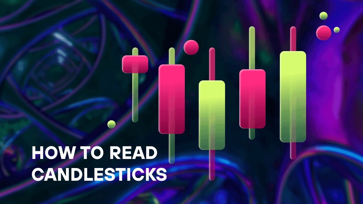
A candlestick consists of two main components: the "body" and the "wick" (or "shadow"). The body of the candle represents the range between the opening and closing prices. If the closing price is higher than the opening price, the body is typically colored green or white, indicating a bullish period. If the closing price is lower than the opening price, the body is usually colored red or black, signaling a bearish period.
The wick (or shadow) extends from the top and bottom of the body, representing the high and low prices of the period. The upper wick connects the body to the high price, while the lower wick connects the body to the low price. The wicks provide information on price volatility and the strength of buying or selling pressure during the period.
By examining the size and color of the candle bodies and the length of the wicks, you can glean valuable insights into market sentiment and potential future price movements. In the next sections, we will explore how to interpret these candlestick chart patterns and apply this knowledge to cryptocurrency trading.
Candlestick vs. Bar Charts
Candlestick charts and bar charts are both popular methods for visualizing price data, but they differ in presentation and the ease with which you can interpret the information. While candlesticks use "candles" to represent price movements, bar charts use horizontal bars to display the same data.
In a bar chart, a vertical line represents the high and low prices during a specific period, while two horizontal lines extending from the vertical line represent the opening and closing prices. The left horizontal line indicates the opening price and the right horizontal line indicates the closing price. Although bar charts also provide the same four data points as candlestick charts, the latter are generally considered more visually appealing and easier to read due to the use of colored bodies and distinct wicks.
How to predict candlestick charts
Predicting future price movements based on candlestick charts involves identifying and interpreting various patterns that may indicate potential trend reversals or continuations. While no method is foolproof, recognizing these patterns can help you make more informed decisions about when to enter or exit a trade. Here are some common candlestick patterns.
Bullish and bearish engulfing patterns
These patterns occur when a candle's body fully engulfs the body of the previous candle. A bullish engulfing pattern consists of a small bearish candle followed by a larger bullish candle, suggesting a potential reversal to the upside. Conversely, a bearish engulfing pattern consists of a small bullish candle followed by a larger bearish candle, signaling a potential reversal to the downside.
Hammer and inverted hammer
The hammer pattern is a bullish reversal pattern that appears at the end of a downtrend. It consists of a small body at the upper end of the trading range and a long lower wick, indicating that sellers pushed the price down, but buyers managed to push it back up. The inverted hammer is a similar pattern but has a long upper wick instead, suggesting that buyers attempted to push the price higher but were met with strong selling pressure. Both patterns may signal a potential trend reversal.
Doji
A doji is a candle with a very small or nonexistent body and roughly equal upper and lower wicks. This pattern indicates indecision in the market, as neither buyers nor sellers were able to gain control during the period. Doji candles may signal potential trend reversals or continuations, depending on the context and the preceding price action.
Morning star and evening star
The morning star is a bullish reversal pattern consisting of three candles: a large bearish candle, a small-bodied candle (often a doji), and a large bullish candle. This pattern suggests a potential shift in momentum from sellers to buyers. The evening star is the bearish counterpart, consisting of a large bullish candle, a small-bodied candle, and a large bearish candle, signaling a potential shift in momentum from buyers to sellers.
Understanding these patterns and applying them to candlestick charts can help you anticipate potential price movements and make more informed trading decisions.
How to read a candlestick chart: interpretation
Interpreting candlestick charts involves analyzing the size, color, and shape of the candlesticks, along with the patterns they form over time. This analysis can help you identify trends, market sentiment, and potential trading opportunities. Here's a step-by-step guide on how to read a candlestick chart:
Determine the timeframe. First, choose the timeframe you want to analyze. This could range from minutes to hours, days, or even months, depending on your trading strategy and goals. Keep in mind that short-term timeframes may be more susceptible to market noise, while longer timeframes can provide a broader perspective on price trends.
Identify the trend. Observe the overall direction of the candlesticks. If the majority of candlesticks are green and the closing prices are consistently higher than the opening prices, it indicates an uptrend. Conversely, if most candlesticks are red and the closing prices are consistently lower than the opening prices, it suggests a downtrend. Examine the size and color of the candlesticks. Large green candlesticks indicate strong buying pressure, while large red candlesticks signal strong selling pressure. Small-bodied candles or doji candles, on the other hand, suggest indecision or a potential reversal in market sentiment.
Observe the wicks. Long wicks can indicate significant price volatility or rejection of certain price levels. A long lower wick on a green candlestick, for example, suggests that buyers managed to push the price higher after an initial dip, indicating strong buying interest. Similarly, a long upper wick on a red candlestick indicates that sellers managed to push the price lower after an initial surge, signaling strong selling interest.
Look for patterns. As mentioned earlier, various candlestick chart patterns can provide clues about potential trend reversals or continuations. Familiarize yourself with common patterns such as bullish and bearish engulfing patterns, hammers, inverted hammers, doji candles, morning stars, and evening stars. Recognizing these patterns in the context of the overall trend can help you make more informed trading decisions.
How to read candlestick charts for day trading
Day traders often rely on shorter timeframes, such as minutes or hours, to identify potential trading opportunities. When trying to understand how to read a candlestick chart for day trading, it's essential to consider the following:
- Choose a suitable timeframe: day traders typically focus on shorter timeframes to capture short-term price movements. Experiment with different timeframes, such as 1-minute, 5-minute, or 15-minute charts, to find the one that best suits your trading style and strategy.
- Monitor support and resistance levels: identify key support and resistance levels on the chart, as these can serve as potential entry or exit points for trades. Candlestick chart patterns that form near these levels can provide additional confirmation of potential price reversals or breakouts.
- Use technical indicators: combining candlestick analysis with other technical indicators, such as moving averages, RSI, or MACD, can provide additional insights into market trends and potential trading signals. This approach can help you filter out false signals and improve the accuracy of your trading decisions.
- Manage risk: day trading carries inherent risks due to market volatility and rapid price movements. Always use proper risk management techniques, such as stop-loss orders and position sizing, to protect your capital and minimize potential losses.
This guide wouldn’t be complete without this: DYOR! Successful trading requires market understanding and deep analysis. No technique or general recommendation guarantees profit.
Conclusion: how to read crypto candlestick charts
So, now you know how to read crypto candlestick charts. Continue reading other articles on our blog to become a pro trader. And when you're ready to take action, start trading on the WhiteSwap DEX! Good luck!


